BUX

Students want motivation to do work. BUX gives students motivation through encouragment from their peers and a calendar that automatically schedules in work during free times.

Image of a mobile keyboard
Image of a keyboard
Another image of a keyboard

I took a UX course in Berlin and this is the project that my teammates and I came up with. We were trying to juggle exploring the city and finishing our projects. The idea of mobile apps targeting productivity might seem overdone, but we realized that none of us actually used any kinds of productivity apps. We hope that this is unique and different from what the current market has to offer.

Problem

Productivity. How do we make the most out of our time? The problem is that students struggle to balance their free time with work. How do we make students more productive and more efficient? How do we evoke good habits to form good studying techniques?

Target audience

Post-secondary students, but this can be extended to professionals or anyone who wants to make the most out of their time.

User research

Research instruments
  1. Interviews
  2. Questionnaries
  3. Scientific journals (happiness and productivity, habits, design for decision, effect on framing incentives on student productivity)
Results
  1. Little reliance on technology: Very few participants used any type of software tool to track their work. Some participants we interviewed made basic use of agendas and mobile calendars. One participant said he keeps track of his assignments "all in my head. I have a rough idea and then I check the course website."
  2. Goals and timelines: Procrastination was a recurring topic among all the interviews. Closer deadlines created urgency and a higher work rate. Feelings of guilt and anxiety drove students to action.
  3. Work patterns: Students prefered extended periods of work over short intervals, but short intervals were preferred over complicated and unfamiliar work.
  4. Habits play a BIG role in our life: Habits are automatic and are mostly done on an unconscious basis. By changing our little habits, we have the ability to stick to routine and complete the tasks we are meant to do, whether that is doing the laundry or taking out your dog for a walk every morning before work.

Goal

Users need a moble application that is personal and engages and motivates them to set goals and hit deadlines. This may include:
  • A calendar or to-do list of tasks and deadlines
  • Regular reminders of approaching deadlines
  • A progress indiciator to show completed work items
  • Motivation to complete work items

Low-fi prototypes and formal usability testing

Protoype
Home
  • The priority box was ignored most of the time because participants did not understand what !* meant.
  • One participant thought everything outside the box was optional and the only scheduled tasks was whatever in the box.
  • One participant mentioned that whatever in the box was not option because if it were, it would be part of the checklist.
  • Most participants found it difficult to know what tasks they had to do for the day.
Protoype of the home page of BUX
Calendar
  • This page only allowed to view tasks for each specific day.
  • Calendar page was unable to provide a list of all tasks.
  • Participants found it frustrating to not be able to view all tasks.
Prototype of the calendar page of BUX
Add work item
  • This page was not too complicated, but participants did not understand what "hours spent to study per day" meant.
  • This only became clear after we explained what automatic scheduling meant.
Protoype of the adding work item page
Me
  • Users had a difficult time editing and searching for upcoming events
  • Most participants didn’t think to click the user button to view all tasks and events scheduled
  • Highly unintuitive because user button is usually to edit profile, settings, etc, not to view important functional elements
  • Calendar button was clicked most to view ALL scheduled events

Insights to usability testings:
  • Users don't read everything. Most participants read what they wanted to read. Participants also had their own mental model of where things should be, and they will most likely always stick with that model when they interact with new mobile applications.
  • Font size matters. If a button is too small, users will ignore it. If a button is too big, users will only focus on the button and nothing else.
  • Participants are constantly learning. The order of tasks given shouldn't hinge on the performance of the task, but it did.
  • Everyone is different. It is impossible to make a design perfect. Some participants made mistakes where others didn't. What is important is to accomodate for the general problems.

Final deliverable

Three pictures consisting of the home page, calendar page, and a to-do list page Three pictures consisting of adding a new task, progresss of tasks, and a friends list. Three pictures consiting of adding friends, adding courses, and viewing course pages

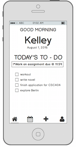
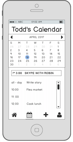
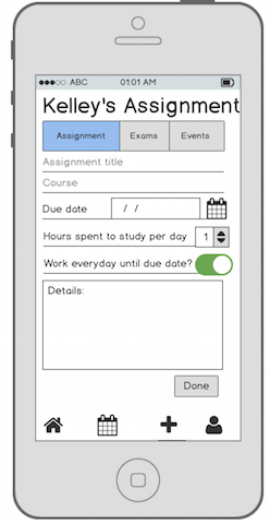
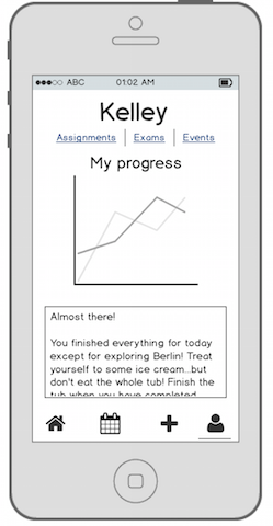
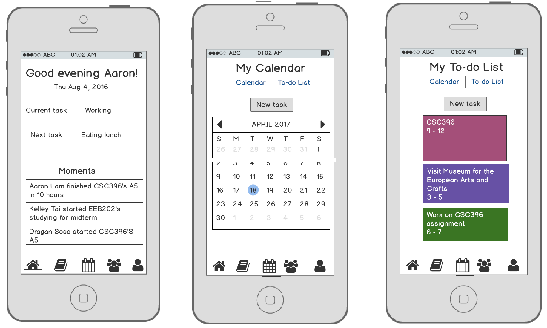
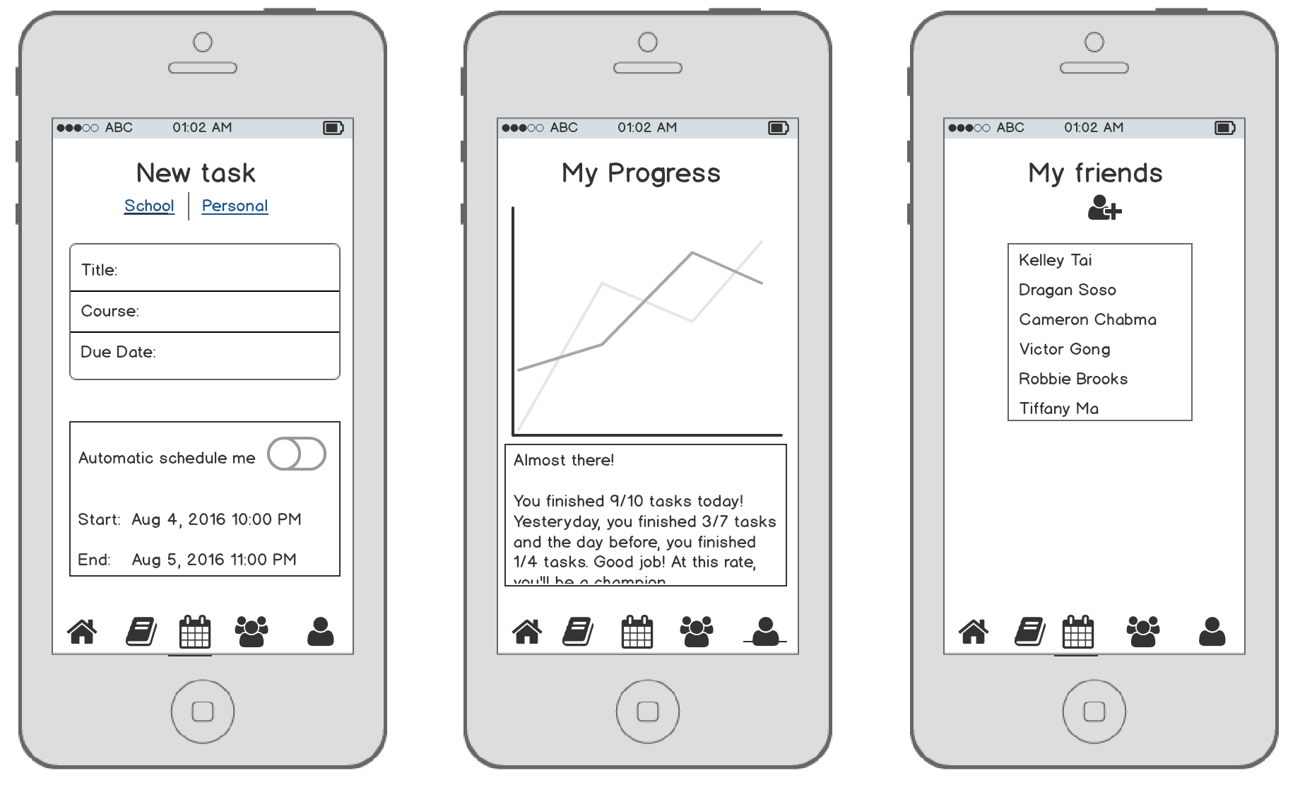
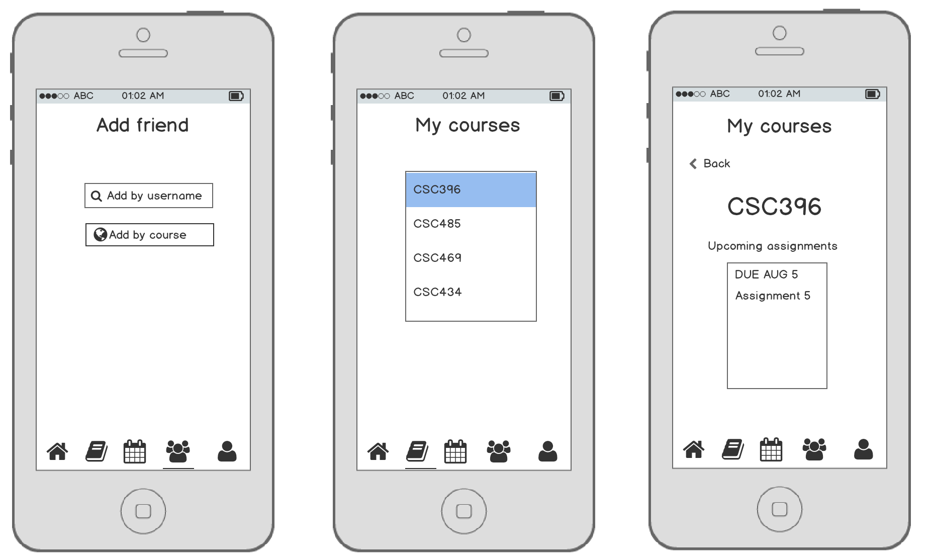
The biggest difference between the prototype and final deliverable is the addition of social media and linkage to a university's student portal. Through the formal usability testing, we found out that users would like to add friends on this mobile app. Users also wanted all the information to be synced into one source, so we incorporated the idea of connecting the app to a university's student portal. The moments section is intended for motivation. For example, If Timurthy sees that Mahomey is doing well and progressing in his studies, Timurthy would want to follow suit.

Final thoughts

BUX received positive feedback from Professor and User Experience Consultant Ilona Posner. This mobile app satsifies the user's needs and meets the goal that we set for ourselves earlier in the project. However, there is room for improvement. By following the user-centered design principle, we are able to further create a better experience for BUX users.